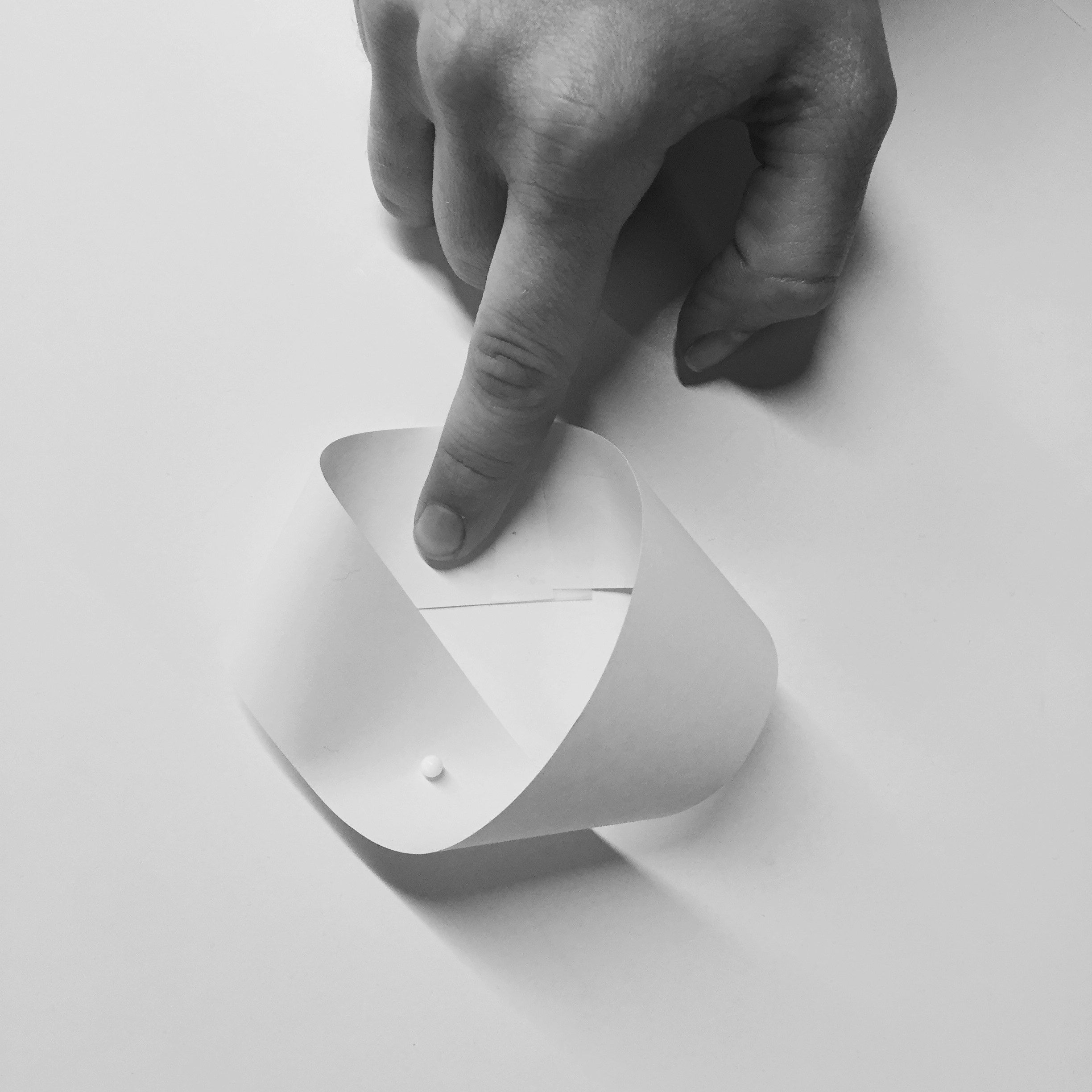
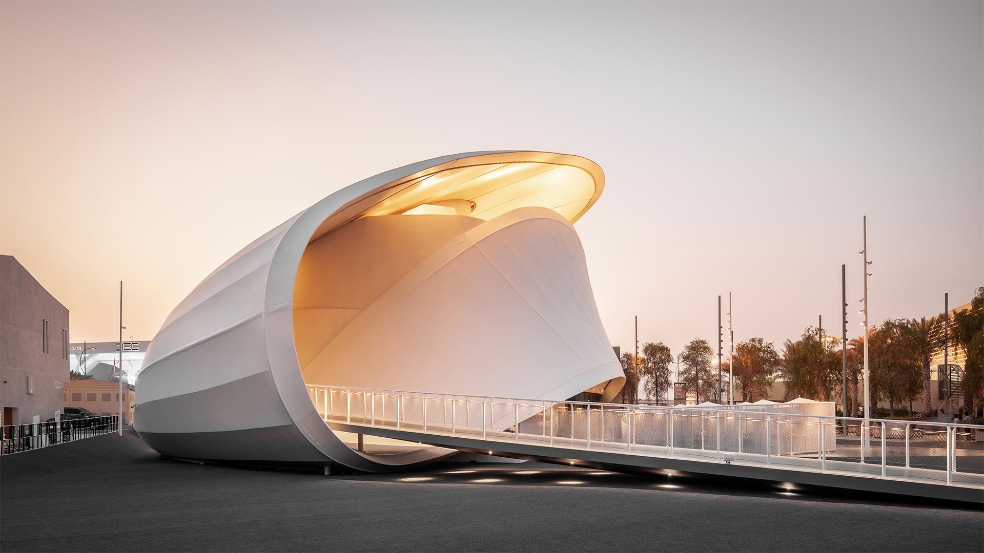
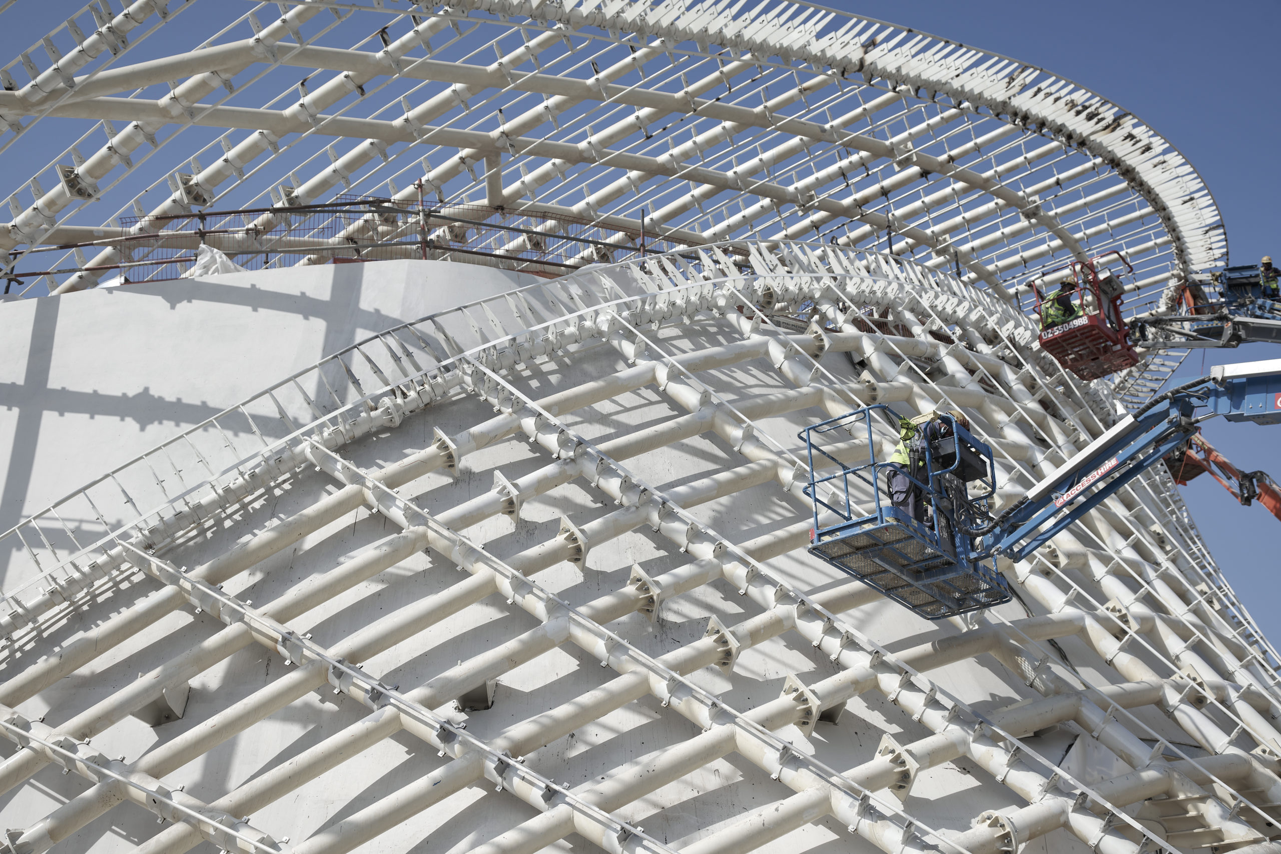
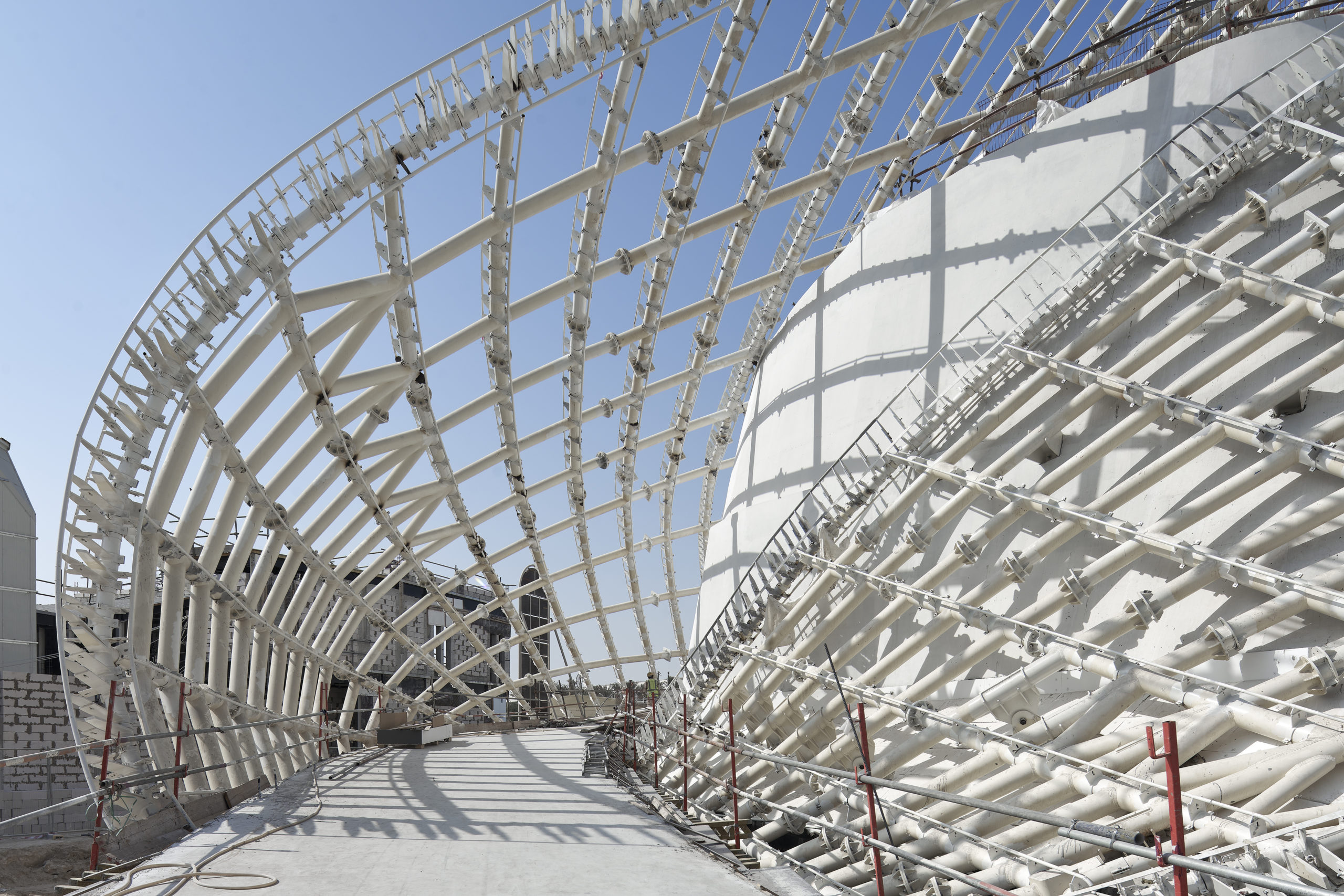
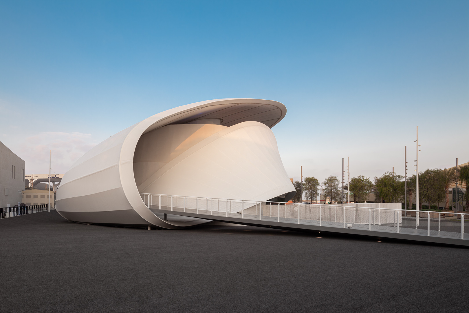
Our main inspiration for the pavilion design comes from our desire to convey a true reflection of Luxembourg’s history, present and future while presenting the values of the country: small but ambitious, intriguing while reassuring, and above all generous and open. What better inspiration than a Möbius strip/loop, a single surface twisted with neither beginning nor end, symbolizing infinity and, most of all, the circular economy and diversity united as one.
The journey of Senses
Luxembourg pavilion at World Expo - Dubai, United Arab Emirates
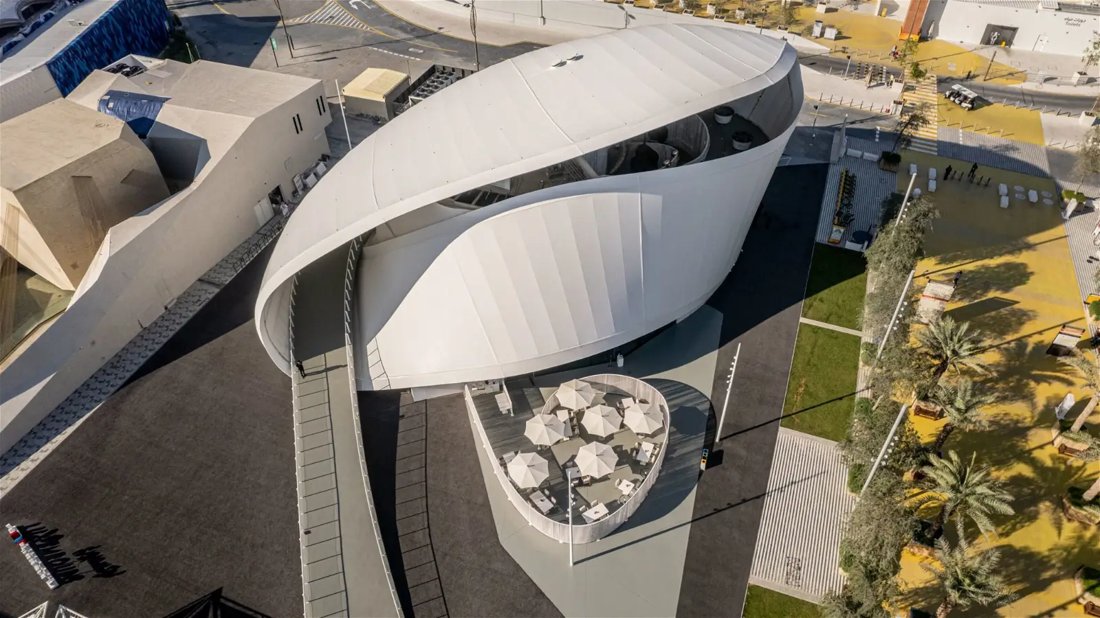
A good flow for visitors to pass through quickly was one of the biggest challenges. This is why we created a setback between the main walking street and the pavilion: the space and distance offer a clear perception of the whole.
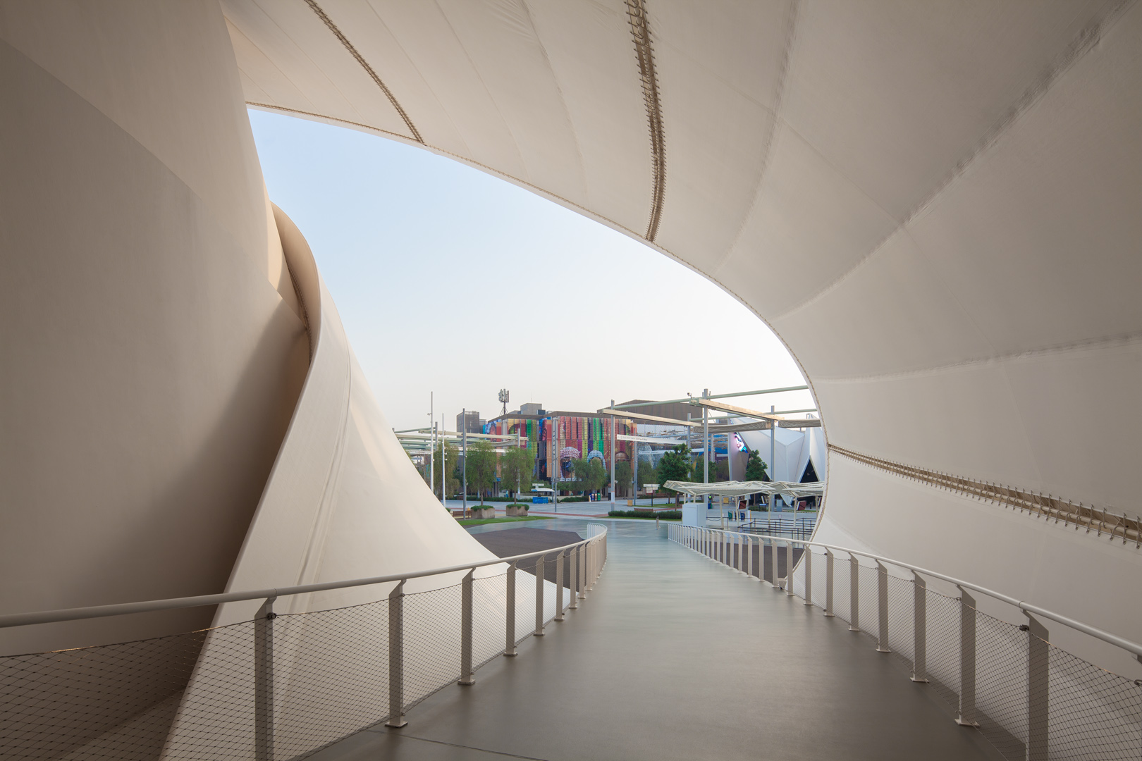
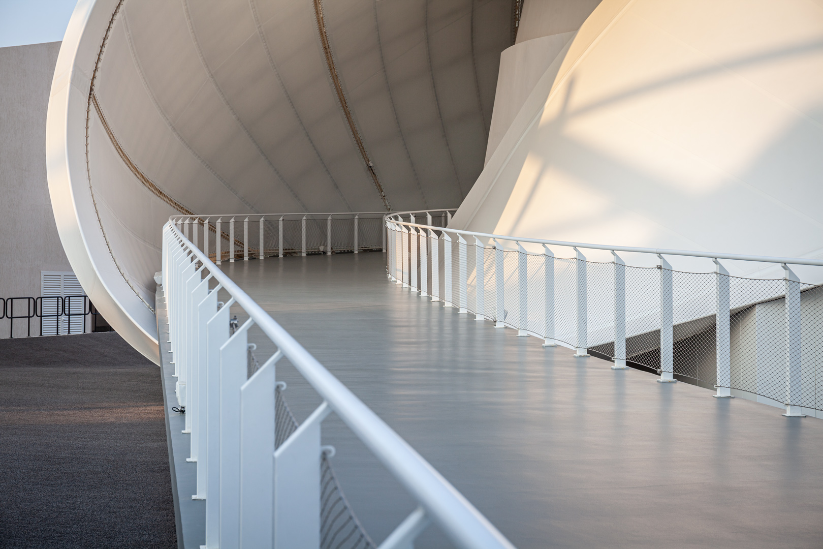
As your experience begins in the waiting line, we designed the ramp as a welcoming red carpet, a guide inviting to discover the building and leading the way in a continuous path, blurring the limit between outside and inside.
How to merge user experience, scenography and architecture?
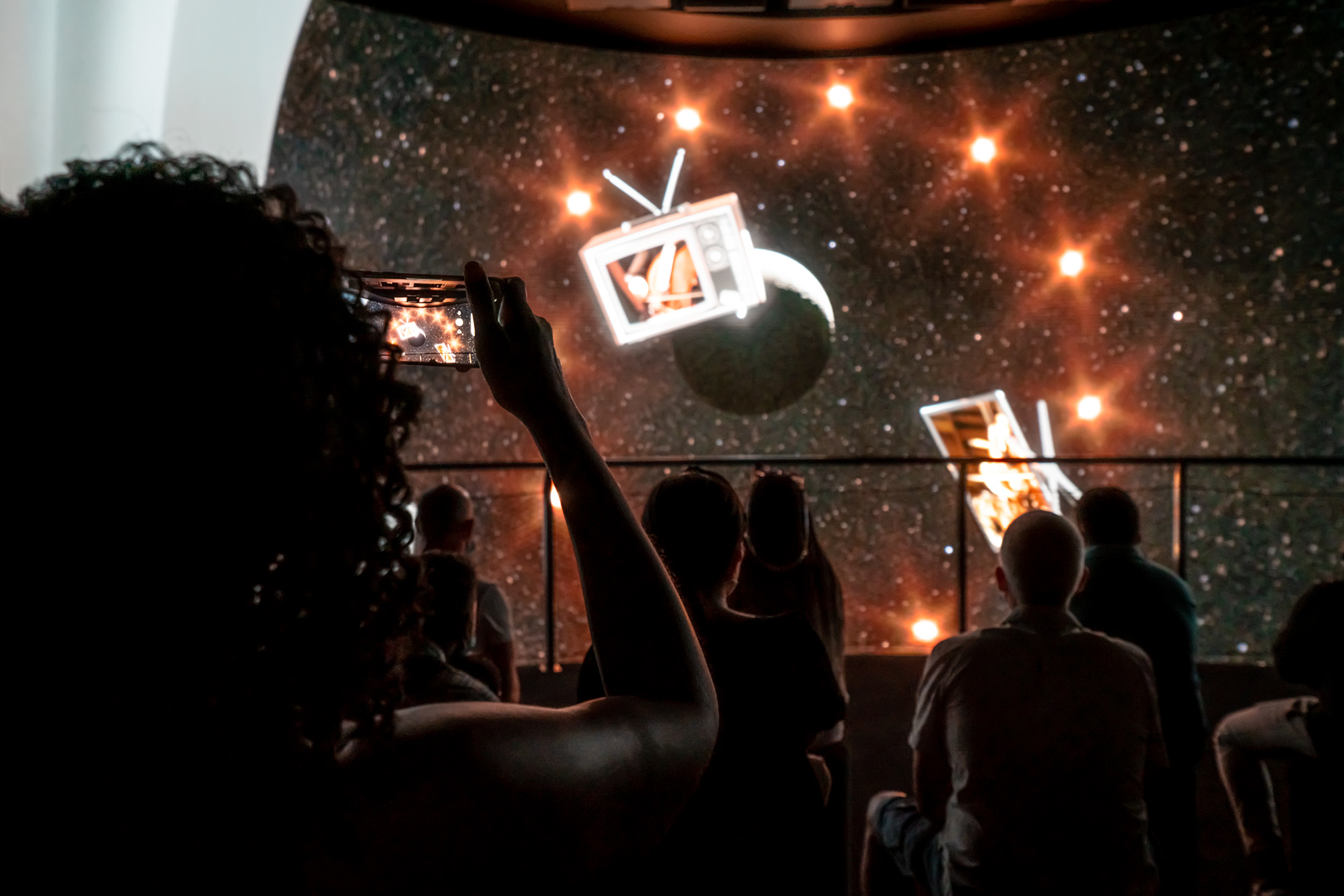
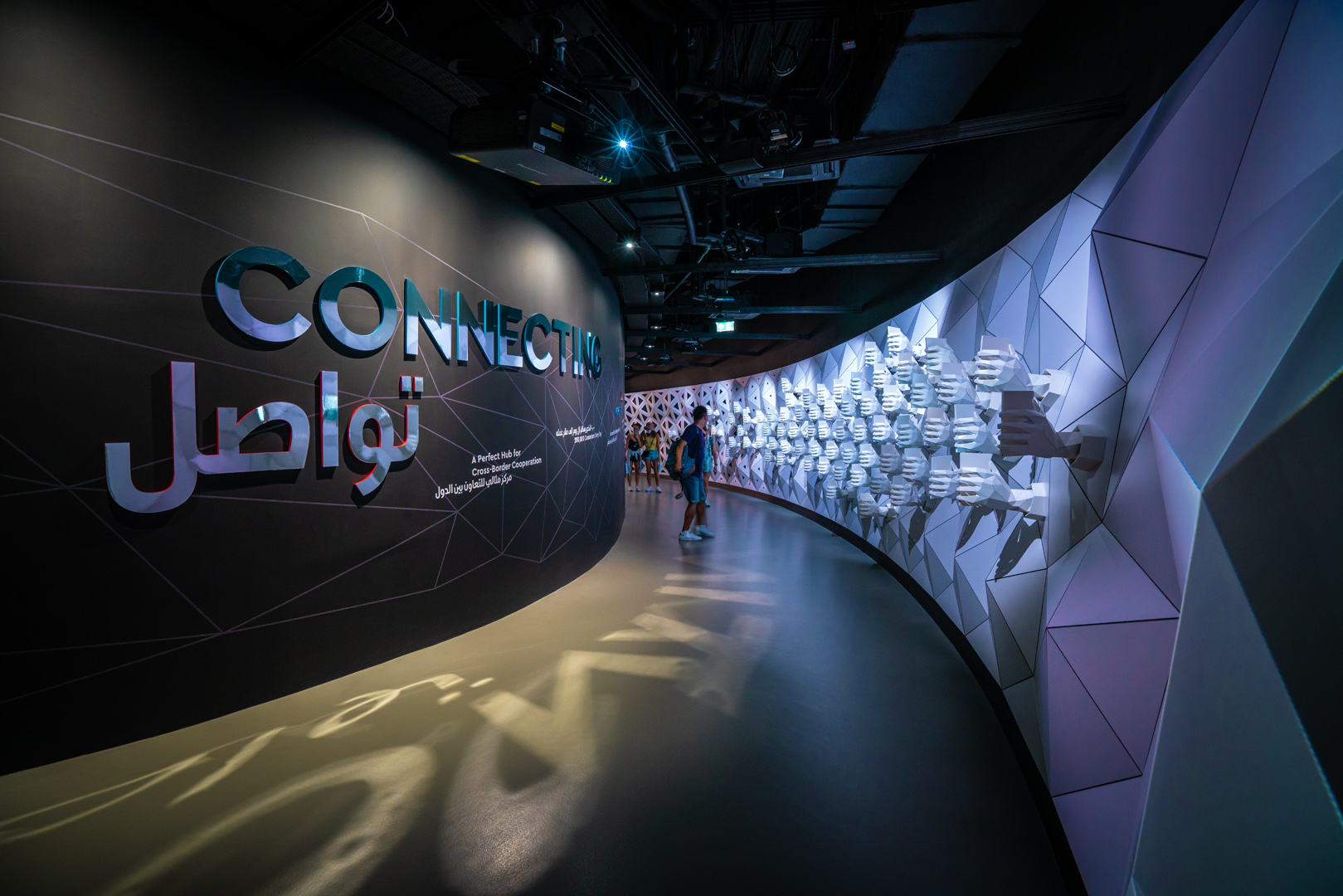
Scenography and architecture are complementary in our mission to make you merge with the exhibition. In a didactic, interactive, and intuitive way, different projections and animations display the country and its people. Altogether, it creates a continuous flux of images from start to finish for your experience on the top second floor. The ribbon becomes a multilayered scenography canvas, alternating floor, wall and ceiling as means of expression.
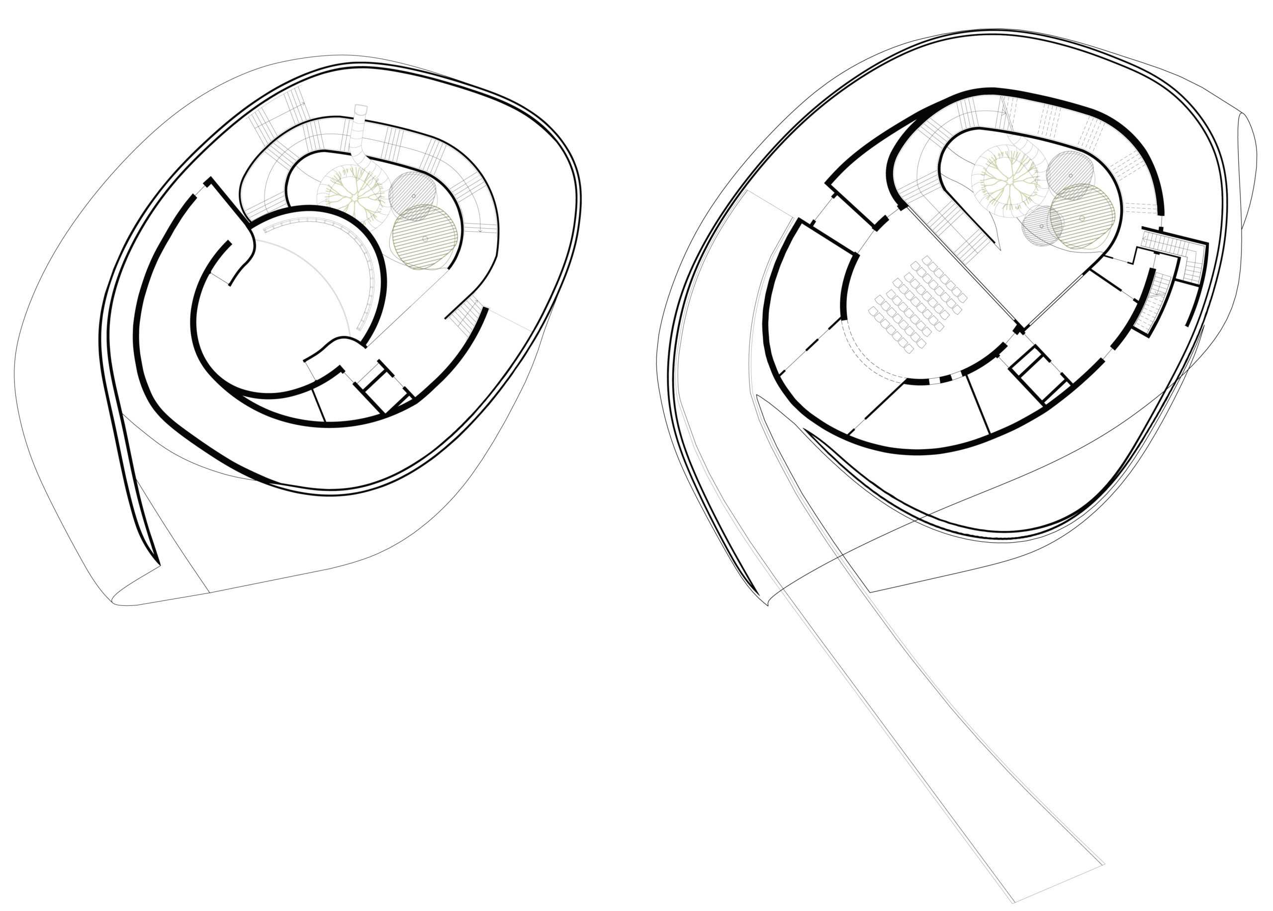
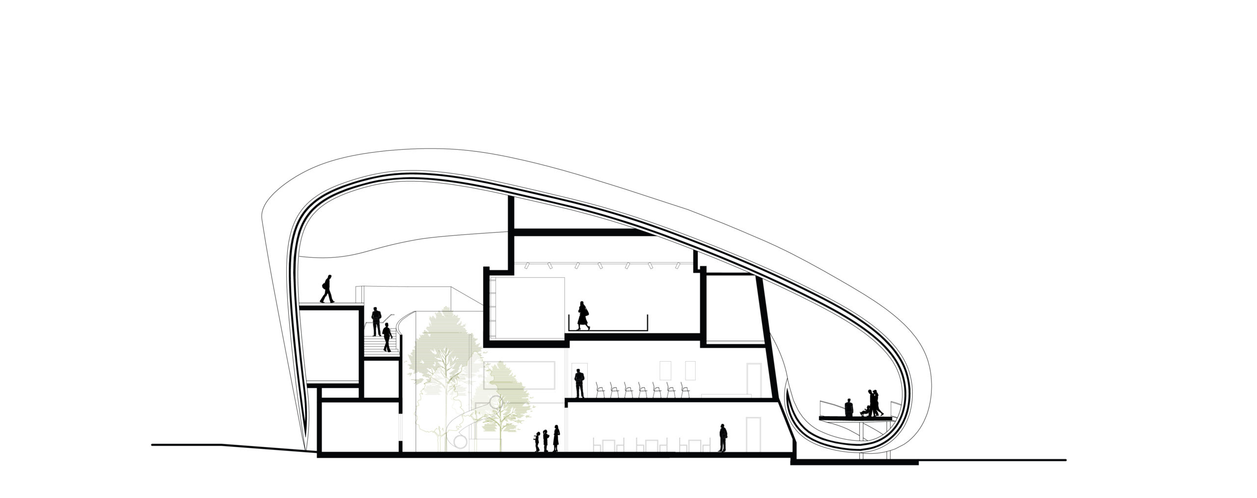
The ground floor accommodates the storage area accessible from the back, restrooms, VIP suite and administration unit with the visibility over the central area, and the restaurant with an open kitchen and the gift shop oriented towards the front area.
The first floor, accessible directly from the main ramp, is a multi-functional space. In case of a concert, reception, conference, the side door is closed, and the ramp guides visitors without interruption towards the top. In case of a temporary exhibition, the door serves as a barrier, and the indoor space becomes an intuitive part of the flow.
The second floor is the highest reaching point, dedicated to the space themed exhibition. To reach the earth again, a slide down through the picturesque green patio concludes the journey in a funny, playful way.
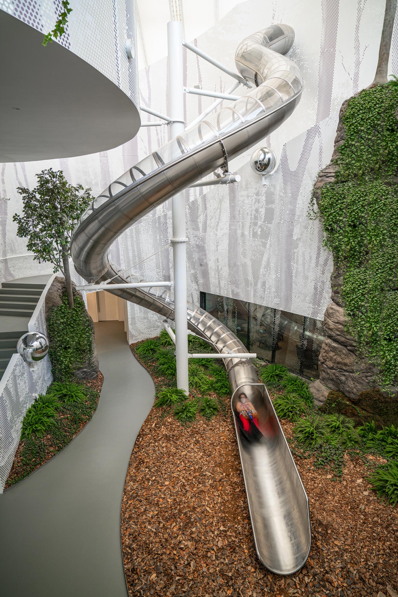
The journey inside is continuous but constantly changing. While moving between the inner and outer protective skins, the feeling of being simultaneously in and out prevails. The proportion of the space is constantly changing, just as Luxembourg offers similar alterations in perception due to its very particular and unique landscape. Different visual connections are created parallelly on different levels and through several stages. Ambiances and moods are shifting instantaneously, sparking curiosity to get to know the best of our country.
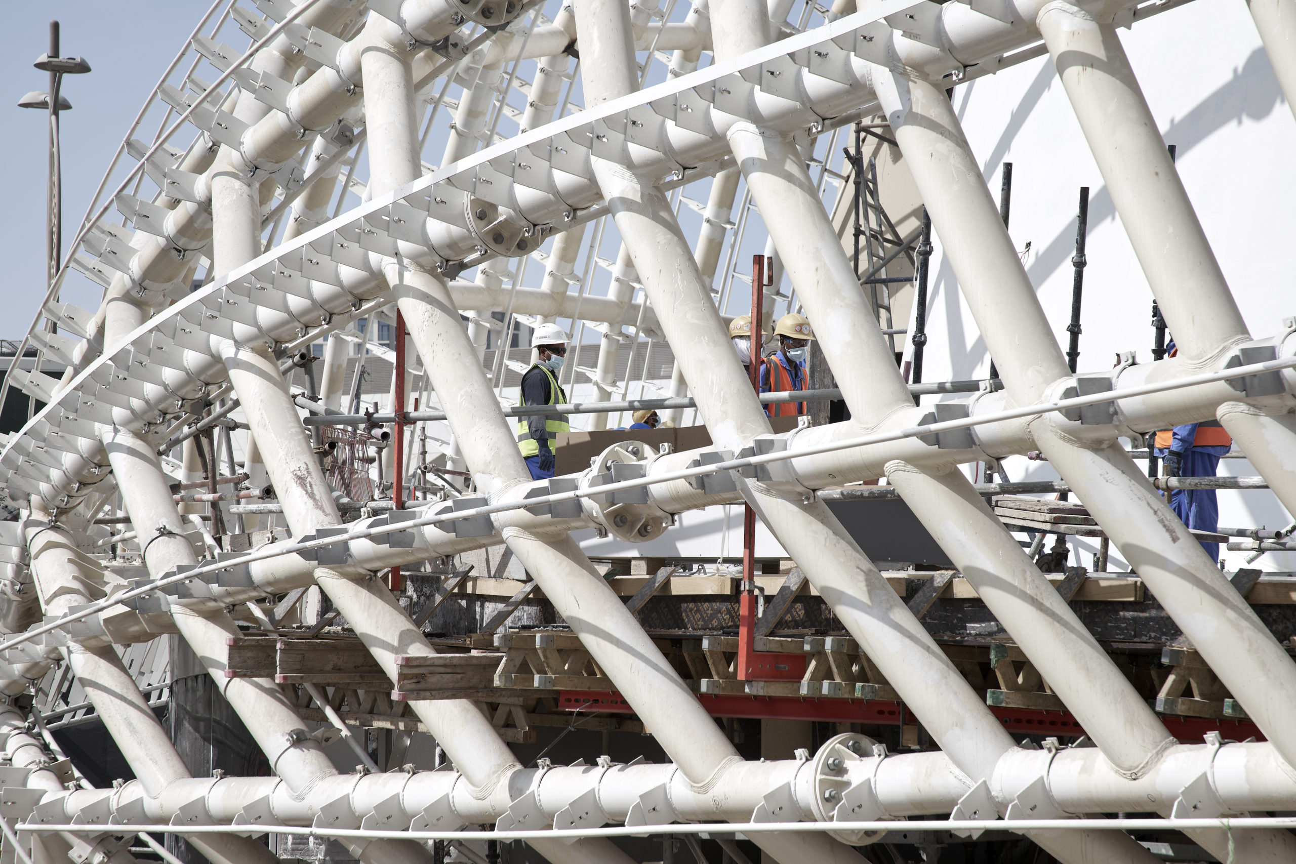
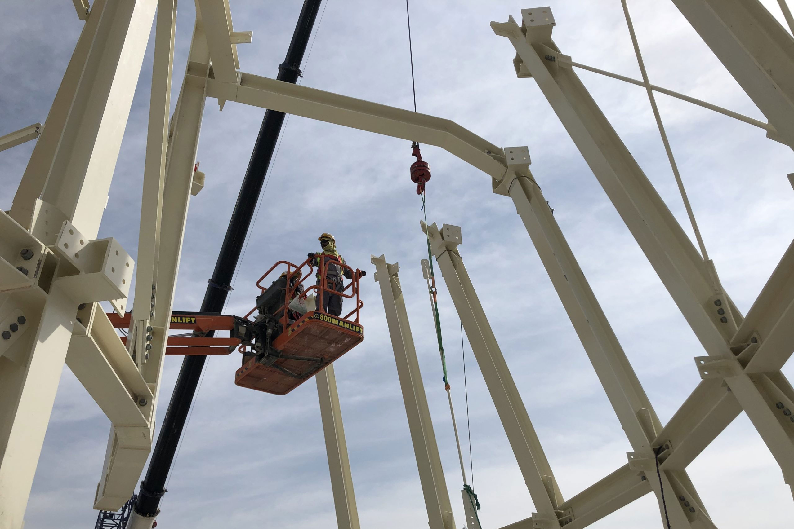
One of the requirements was to use 70% of reused or recycled material. A challenge we met by opting for steel construction. The fiber glass membrane, although difficult to recycle, can be reused by the producer who agreed specifically to it for the project.


